
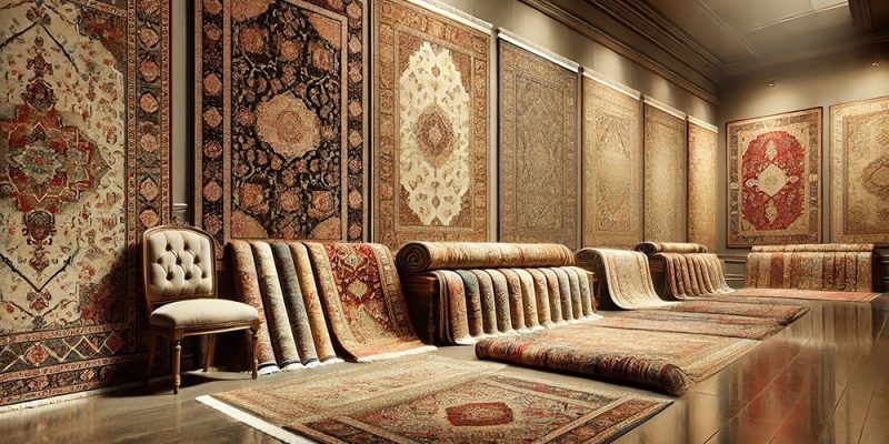
A space can appear much larger than it actually is by how lines, colours, and designs interact with your eye, sometimes without moving a single wall. Many homeowners discover these visual tricks when shopping at the best rug shop in Canberra where experts demonstrate how different patterns affect room perception. Using diagonal patterns allows your eye to follow longer sight lines rather than stopping at nearby walls in tight spaces. The brain immediately measures flooring that runs straight across a room. These patterns cost more to install because of the precise cutting required, but the spatial impact makes the investment worthwhile in space-starved homes.
Light patterns open up rooms.
- Cream and beige patterns reflect natural light around the room instead of absorbing it like dark floors do
- White and pale grey designs blur the boundaries between floor and walls, making spaces feel endless.
- Light colours eliminate visual weight that would otherwise make rooms feel heavy and confined.
- Soft neutral patterns work with any decor changes while maintaining their space-expanding effects.
Dark flooring creates a definite floor plane that your brain reads as a boundary, emphasizing how small the room actually is. Light patterns float, removing that psychological barrier and making spaces feel like they extend beyond their actual walls. This effect works particularly well in basement apartments and studios where every visual trick helps.
Continuous flow eliminates barriers
Breaking patterns at doorways chops up your visual field and makes each area feel smaller and more isolated. Running the same pattern throughout an open floor plan creates one large visual space instead of several tiny compartments. Your eye reads the entire area as unified, making a small apartment feel much more spacious than it would with different flooring in each section. Scale becomes crucial here. Tiny patterns look busy and create visual chaos in small spaces. Huge patterns overwhelm compact rooms and make furniture look like dollhouse pieces.
Medium-scale patterns hit the sweet spot, providing enough interest to look intentional without creating proportion problems that make spaces uncomfortable. Geometric patterns with clean lines work better than organic designs in tight spaces because they suggest order and precision. Your brain interprets this organization as intentional design rather than making-do with limited space. Regular repetition creates a rhythm that moves your eye smoothly around the room instead of stopping and starting at random elements.
Smart borders frame space
- Wide borders around room edges create picture frames that make the central areas look larger.
- Narrow borders are defined without eating up precious visual real estate.
- Low contrast borders maintain flow, while high contrast ones create hard stops.
- Border width should match room size – big borders overwhelm small spaces completely.
- Colour matching between borders and centres creates seamless expansion effects.
Border treatment can make or break the illusion. Thick dark borders around light centres create frames that emphasise the actual room dimensions, defeating the whole purpose. Subtle borders in similar tones provide just enough definition to look finished without creating visual barriers that limit space perception. The choice transforms cramped quarters into comfortable living spaces that feel much bigger than their actual measurements suggest.


Comments